Sad Robot, Happy Robot
About This Project
Adhd Help Triptych
Vector Design, Layout Design
The Rocky Mountain College of Art and Design
Sketches
We were tasked with creating sketches of three different sets of three posters. I decided to try three levels of relative complexity to solve this problem. Triptych 1 was the second most complicated. It was metaphorical and illustrative of the monstrous feelings I hold for a lifetime of punishments and suffering I have endured. Had I gone with this one, I would have moved drawing 1 to the middle, as this would have made for a more consistent narrative flow.
Triptych two is the least complicated poster. I aimed to focus purely on the subject and for that subject to take up less space and have less visual complexity. It was the first of the series to have a more hopeful thrust to its narrative.
Triptych three was the most complicated idea. It had the most visual elements and potentially the most complex drawings. As with triptych 2, this poster series went in a more positive direction than one. While initially I was really enamored with one, it was more of an art project compared to three, which felt like an actual advertising campaign.
Environmental Contact
Previous
Living a life with compromised executive functions is a waking nightmare. While I may not be slow-witted, I am a slow learner. I am also constantly confronted with embarrassments born from errors caused by a limited working memory. It sucks. My fight with Severe Attention Deficit Disorder Non-Attentive Type has grown to take an immense portion of my time and attention. When I was instructed to make a poster triptych for my portfolio class, I immediately knew what the central topic would be.
Color and Font
I chose Arial because it is easy to read and does not distract from the other aspects of the project. I considered a more dynamic font, but I wanted it to support the story and not be a part of it.
I chose fairly muted tones for the colors. I wanted to illustrate the emotional weight the robot was feeling. These colors, mixed with a halo gradient, helped create that contained feeling. Conversely, opening that halo helped relieve that weight and provide a feeling of freedom.
Digital Drafts 1 and 2
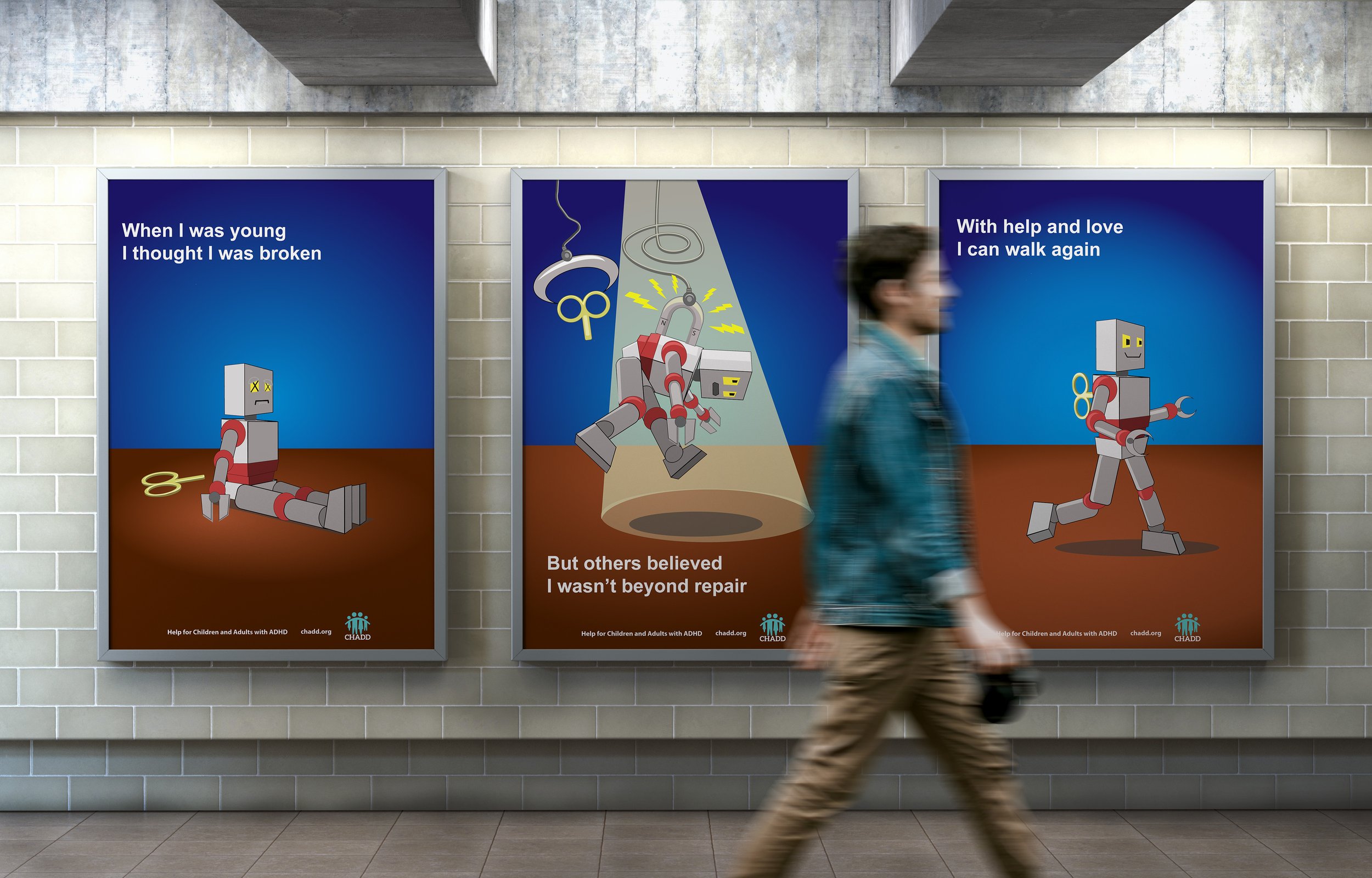
Ultimately, I decided that the robot was the best of the three ideas. I tried a few ideas out in the digital draft phase. I wanted to focus on the robot, so I gave him a spotlight and no real detail to the background.
The spotlight being in all three panels seemed a little too much. While an interesting idea, the cogs around the text created too much visual weight. The text is supposed to support the composition, but it is taking away from the action by competing with it.
Version two featured several changes. First, I removed the spotlight from panels one and three and instead used a halo gradient to give the floor and wall some depth and help focus on the robot. I removed the cogs and moved the text around. I added a call to action and associated organization. I also changed the claw that was holding the robot aloft to a magnet. Finally, I changed the perspective on the key in panel one to look like it is lying on the floor.
Final
The final version represented more adjustments than significant changes. The halo gradient in panel three was slightly increased to make the robot in panel one feel more enclosed. I moved the key to not overlap the robot and to look like it had just fallen out. I added more visual emphasis to the magnet, including removing the red ends. The red made it almost look like the magnet was a part of him. I also adjusted the typography to be more consistent.
Next


