About This Project
Art Show Poster
Digital Photography, 3D Design, Painting, Digital Image Manipulation
A physically built object, photographed then added to a digitally designed poster
The Rocky Mountain College of Art and Design
Waves Goodbye
3D project Part 1
The armature was created by taking measurements of my hand and guessing at how I would need to scale it down to account for the bulk of additional materials for the final product. I used copper wire and pliers to shape the armature into what was a rough representation of my hand and forearm. This was a laborious, and sometimes painful, process. But Eventually I had a hand, and one that would stand on its own! As can be seen here I was experimenting with the possibilities of various anthropomorphic forms. Chief among my ideas was to turn this into some sort of hand spider. Creepy.
3D project Part 2
Many hours of adding foil inside and out of the hand, followed by hot gluing, brought to life the gauntlet of a god. Feeling that it still needed something, I crafted the base using the polymer clay I had initially purchased to coat the hand. I primed the base and, using my experience as a miniature painter, I painted it to look like the ocean. I don’t often praise myself, but even I found the result to be satisfactory.
Environmental Contact
Previous
This project was born into the world during a 3D (physical not digital) design class. It was initially built as a wire armature with an uncertain future purpose. Was it going to just be a hand? Was I going to give it an abdomen and make it a spider? Eww, probably not that. Ultimately I decided that it would be the hand of some elder sea god, bursting forth from the ocean.
Obviously, the statue was not a graphic design project. But, it was a piece that could play a compelling role in a graphic design project. With that in mind I took my mighty sea god hand and set about adding it to an event poster.
Color and Font
It is a good day when your draft comes close to resembling your final product. That is not to say I did not have to make some revisions. I made some choices, such as adding Japanese wave designs in a bar across the top, which ultimately detracted from the piece. But in the end, the final product looked fairly similar to this.
As stated above, The result was not intended to be a graphic design piece. It could, however, show up in a design piece. I decided to add it to a poster that would advertise an event displaying my works.
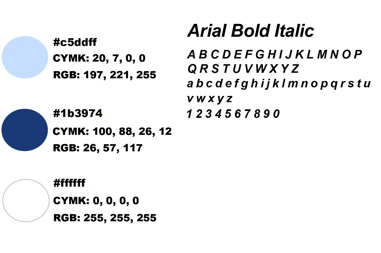
For the font, I chose Arial Narrow Bold Italic. This is a clean, easy-to-read font. The italic gave a sense of motion that resembled a wave.
For the color choices, I went with the obvious idea: the sea. But instead of a pristine, sunny day, I wanted to create an idea of depth and almost loneliness. For this reason, I gave the background darker tones and put the image in a halo gradient..
Final
Here is the final version. The hand stands in radiant majesty, haloed by a dark blue aura. The gradient suggests the crushing depths of Neptune’s realm. The totally real sounding locals that I did not make up just for this project
Next


