Informed Madness
About This project
Info-graphic
Vector Design, Layout Design
The Rocky Mountain College of Art and Design
Sketches
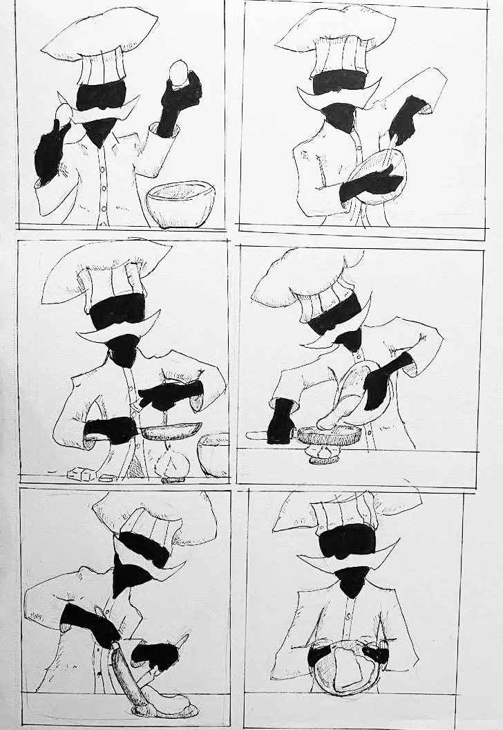
Creepy Chef or Manic Bowl? How is one supposed to choose their favorite child? I loved them both, but that does not mean they would succeed at the given task.
The Chef was inspired by art in a Japanese game called Persona 5. These background posters featured people in fully illustrated outfits, but any exposed part of their body was flat black.
Bowly (as I have taken to calling him) is a more archetypal character. He is reminiscent of early Loony Toons characters and demonstrates a similar energy and expressiveness.
Second Draft
I changed the background to a more vivid blue, as the original was a little dark, which conflicted with the piece's mood. I also moved the title out of the box with the ingredients and changed it to a yellow that I felt associated with the flavor of vanilla. I added two additional panels to show the process of icing the cake, though adding the countertops caused a visual issue.
Previous
As I will say again and again, I love my strange cartoon characters, especially when I can use them to inform or educate. This fact made my Information Visualization class one of my favorites. For this project, we were tasked with instructing someone on how to make one of a handful of recipes using only images.
Color and Font
Bauhaus 93 felt like a natural choice for this project. It has a personality but is still readable. Something that can not be said for all designer fonts. I felt this gave a complementary feeling to the crazy little bowl that would go on to star in this project.
I chose shades of blue as the primary color for this work. This worked for Bowly but was maybe a bit monochromatic as part of the background. The blue background would take me several iterations to walk away from.
First Draft
Ultimately, I decided the bowl and vanilla cake recipe was the most successful idea. I felt that the animated character's archetype was more readily recognizable. Bowly may also have bullied me into choosing him.
Final
I was encouraged to find a way to get Bowly out of the sequential boxes. I tried several variations, but honestly, just having him floating in space in the same configuration did not do anything interesting visually. I decided to try to create a spiral pattern, as this could create visual motion and some interesting shapes.
I could have made this harder for myself, but I am struggling to think of how. Finding the right balance that naturally lead the eye across the page, and made effective use of negative space, was tough. I think the thing that really helped bring the whole thing together was moving the title to the bottom of the page and the beginning of the spiral. This created a firm anchor point but also did not compete with the motion of the spiral.
Environmental Contact
Next


